These components are starting points when making content (like pages, pop ups, widgets) on the site.
They help us be consistent, take care of common problems and stop you needing to reinvent the wheel or digging through ancient posts to find stuff you need.
But how they work is not set in stone and can be adapted to better fit the context of whatever the content is.
These guides help you write and create content for our sites and marketing.
Use them to keep things site consistent, useful and enjoyable to read.
In turn this makes for a good experience for the people using the content: teachers, students, scientists.
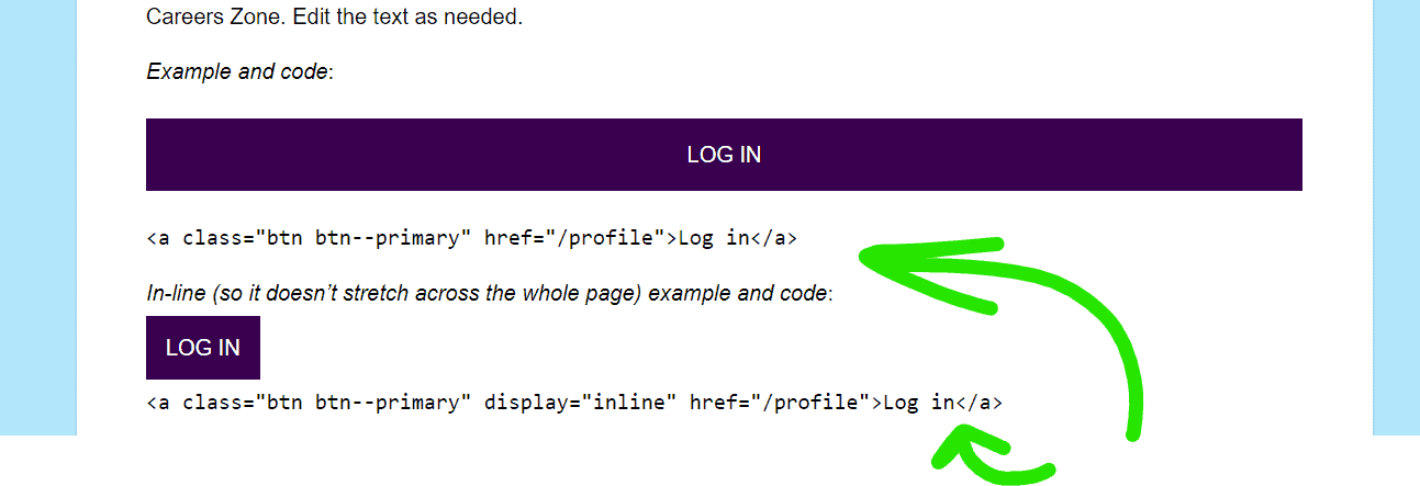
Used when someone wants to completes an action on the site, such as logging in, submitting an application, joining Careers Zone. Edit the text as needed.
<a class="btn btn--secondary" href="/profile">Log in ❯</a>
3️⃣ ‘Call to action’ button (CTA)
Used to encourage someone to start a process, or navigate to to the start, i.e. scientists moving from info page to application page. Adapted from Submit, but note different typography and use of ❯ to indicate ‘going somewhere’. Edit the text as needed. Calls to action should be specific, direct and use active language. Get more language advice in the Content Design Guide.
Same as above but in different colour so you can differentiate between two options – again not likely to be needed much. Most pages should only have one call to action.
You’ll spot this typically contain a message that something has happened. i.e. Successfully submitted a questions part of the ASK flow. Can also be helpful for drawing attention on blog posts. If needed, change the colour of the border using style=”border-left: 4px solid #[hex code]” after the class
Example
Thanks for your question! You’ll get emailed about your response as soon as the scientists have time to answer.
Code:
<div id="message" class="error"><p class="notification">Thanks for your question! You’ll get emailed about your response as soon as the scientists have time to answer.</p></div>
Thanks for your question! You’ll get emailed about your response as soon as the scientists have time to answer.
Code:
<div id="message" class="error" style="border-left: 4px solid #2fafe3;"><p class="notification">Thanks for your question! You’ll get emailed about your response as soon as the scientists have time to answer.</p></div>
Error Card
Includes handy Exclamation Point for warnings, alerts etc.
Sorry, this event is finished and this zone no longer accepts questions.
Code:
<div id="message" class="error"><p class="notification"><i class="fa fa-exclamation-circle beta"></i> Sorry, this event is finished and this zone no longer accepts questions.</p></div>
Bright box with border
Used to draw attention to something very different to the main content, e.g pointing students towards post event survey in winner blog posts. Message cards above may be better for softer messages.
Example
Students! Did you do your profile survey? Check your email for a chance to win a £20 voucher and tell us what you think now!
Code:
<div style="margin-top: 15px; margin-bottom: 15px; border: 1px solid #cc0066; background-color: #ffeefe; padding: 15px;"><strong>Students! Did you do your profile survey? Check your email for a chance to win a £20 voucher and tell us what you think now!</strong></div>
Card with shadow
Improve communication skills
“I’m a Scientist is the best crash course in science communication”Ben, physicist
Frequent practise, honest student feedback, and text-based interaction equals effective training – read the research
Code:
<div class="card card--gallery material-shadow"><h3><span style="color: #eb008b;"><b>Improve communication skills </b></span></h3><p><em><span style="font-weight: 400;">“</span><span style="font-weight: 400;">I’m a Scientist </span></em><span style="font-weight: 400;"><em>is the best crash course in science communication”</em> <strong>Ben, physicist</strong></span></p><p>Frequent practise, honest student feedback, and text-based interaction equals effective training – <a href="https://about.imascientist.org.uk/category/evaluation/scientist-benefits/">read the research</a></p></div>
Case study block quote divs
These can be used at the top of case study posts to put across the main point in the language of the scientist or teacher.
“I really feel it’s a great introduction to public engagement and a fantastic way to explain what biomedical science is all about.” Hayley Pincott, University Dental Hospital
Code:
<div class="card card--gallery material-shadow"><img decoding="async" class="avatar avatar--round media-obj__fig alignleft wp-image-1229" src="https://imascientist.org.uk/wp-content/blogs.dir/505/files/2022/02/HayleyPincott.jpg" alt="" width="150" height="150"><br><span style="font-size: large;">“I really feel it’s a great introduction to public engagement and a fantastic way to explain what biomedical science is all about.”</span><br><strong>Hayley Pincott, University Dental Hospital</strong></div>
This is an alternate version that works nicely as part of a page to link to a full case study
“This experience has been extremely worthwhile. I feel I have learnt so much, especially when trying to communicate sometimes quite complex problems in understandable language”
Code:
<div style="margin-top: 10px; border: 3px solid #ececec; background-color: #fff; padding: 10px; border-radius: 0px; text-align: left; font-size: 100%;"><blockquote><p><strong><a href="https://climatem18.imascientist.org.uk/2018/03/22/thank-you-from-your-winner-stephanie/"><img decoding="async" loading="lazy" class="avatar avatar--round media-obj__fig alignright wp-image-1229" src="https://imascientist.org.uk/wp-content/blogs.dir/505/files/2022/02/Stephanie.jpg" alt="" width="150" height="150"></a></strong><em>“This experience has been extremely worthwhile. I feel I have learnt so much, especially when trying to communicate sometimes quite complex problems in understandable language” </em></p><p><strong><a href="https://climatem18.imascientist.org.uk/2018/03/22/thank-you-from-your-winner-stephanie/">Stephanie Mann, Offshore Renewable Energy Catapult</a></strong></p></blockquote></div>
Link preview card
Used when linking externally and you want to give a clear idea of where people are going. For example to extra resources in Academy Zone.
Quick read
NCCPE Engage Framework Principle 1: Purpose Document detailing good practice principles for public engagement involving universities “I will put purpose at the heart of my engagement practice. Therefore, I will be clear about my own motivations for engaging and intentional about my practice, I will be thoughtful…
Code:
<div class="card card--gallery hover-secondary material-shadow" style="clear: both;"><p><img decoding="async" loading="lazy" class="attachment-post-thumbnail wp-post-image alignleft" src="https://imascientist.org.uk/wp-content/blogs.dir/505/files/2022/02/Screenshot_060319_020630_PM.jpg" alt="" width="122" height="144"></p><h3>Quick read</h3><p><strong>NCCPE Engage Framework Principle 1: Purpose</strong><br>Document detailing good practice principles for public engagement involving universities<br><em>“I will put purpose at the heart of my engagement practice. Therefore, I will be clear about my own motivations for engaging and intentional about my practice, I will be thoughtful…</em></p></div>
Pull quotes for blog posts- big and smaller
Use a pull quote to ‘pull out’ a key quote from a blog post. They help get the message across for people scanning and break up the page so it’s not just blocks of small text.
“
The best crash course in science communication
To adjust the properties of the pull quote, you’ll need to edit its ‘style’ code in the Div tag:
‘max-width’- adjust to 12-17rem to wrap text around it, or increase to 100 rem or 100% to make it full width (good for quotes 9+ words)
‘float’ – change to ‘left’ or ‘right’ position on page
Size of text – change ‘rem’ values after font:, e. g 1.202rem/1.5rem is smaller text, useful for long quotes
The questions asked were both fun and challenging, keeping me on my toes at all times and giving me a fresh perspective and enthusiasm for my own research
Daniel, chemist
Simple quotes Used when quotes are supporting a CTA page, like the scientist and teacher landing pages. Less distracting than a blog post pull quote. – you can change the px to display how far along the background box goes on the page, if you put autopx it will automatically stretch it.
“Incredibly easy to set up and run”
Code:
<div style="margin-top: 15px; margin-bottom: 15px; background-color: #e3f4fe; padding: 10px; max-width: 100%;"><strong>“Incredibly easy to set up and run”</strong></div>
“We exist to support future generations of scientists and are delighted to lend our support to this unique form of engaging, stimulating and relevant interaction with current scientists.”
These come from funders and other partners. This card allows us to feature their logo prominently. Change the max width and ‘float’ element to place it on the page where needed, ‘center’ works best for narrow pages.
Again, you can change the max-width: 400px; to suit the page width – if you want it larger, 600px, smaller 200px etc.
Code:
<div style="margin: 10px; background-color: #f3f3f3; padding: 5px; float: right; max-width: 400px; border-radius: 0px;"><div style="margin: 10px; background-color: #ffffff; padding: 5px; border-radius: 0px;"><a href="https://rsc.org"><img decoding="async" class="aligncenter wp-image-40294" src="https://imascientist.org.uk/wp-content/blogs.dir/505/files/2022/02/RSC_logo_POS_RGB_L-scaled.jpg" alt="" width="243"></a></div><blockquote><p><strong><a href="https://rsc.org">The Royal Society of Chemistry</a> supports <em>I’m a Scientist, Stay at home</em>.</strong></p><p><em>“We exist to support future generations of scientists and are delighted to lend our support to this unique form of engaging, stimulating and relevant interaction with current scientists.”</em></p></blockquote></div>
These are useful for giving a long page (like this one) structure and helping people find what they need quickly.
They are effectively links within the page, instead of some external page. This means they also use the <a> tags. You’ll need two bits of code, one for the link and one for the anchor, the place clicking takes you to.
When adding 3 or more anchor links it’s good to set them apart as a ‘Contents menu’. This is simply a grey div around the anchor links that differentiates them from the rest of the content.
Code:
<div style="margin: 12px; background-color: #f3f3f3; padding: 10px;"><p><strong><a name="top"></a>Contents:</strong></p><ul><li><a href="/design-system/#menus">Contents menu item</a></li><li><a href="/design-system/#menus">Another menu item</a></li><li><a href="/design-system/#anchor">Yet Another menu item</a></li></ul></div>
Icons for Top or Footer menus
See the down arrows in the top menu that indicate there are options available when you hover? Those are Font Awesome icons. They will only appear if you add the following to the display text for your menu options when creating them.
Field labels and description goes before the entry box.
Avoid asking questions in labels. Say what the field is expecting.
Use placeholder text for examples, but not help text. This will disappear when people type.
Change the Submit button to the action people are doing, for example ‘Apply’.
Always write a useful confirmation message.
Gravity forms
If possible, use Gravity forms to collect information. They are the most accessible embedded forms we have. Create a new form in the backend on the Forms menu.
To embed a gravity form, note the ID of your form. Then paste this code below on to your page editor (can be Visual or Text view), between square brackets [ ] – it should automatically detect the form as an embed shortcode and
[gravityform id="2" title="true"]
this will display as:
Or you could use Blocks editor and type /gravity which will give you a list of Gravity Forms to choose from.

“This experience has been extremely worthwhile. I feel I have learnt so much, especially when trying to communicate sometimes quite complex problems in understandable language”